
.svg)
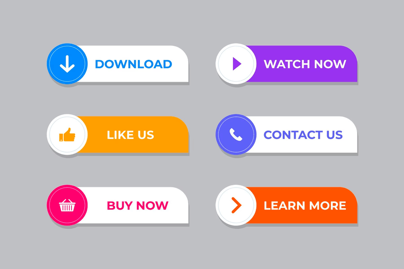
Buttons aren’t just decorative, they’re powerful conversion tools. From call-to-action (CTA) buttons like “Buy Now” or “Read More”, to social share and subscription buttons, each plays a role in guiding readers through your blog and encouraging the next step.
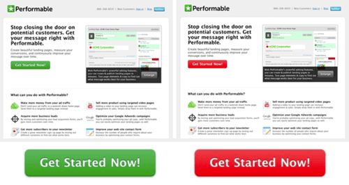
CTAs shaped like buttons can see up to 45% more clicks than plain text links. That means a simple, well-placed button on your Shopify blog post can directly increase engagement and even drive sales. In ecommerce, every click matters, and a button helps turn readers into customers.
When thinking about how to add a button to your Shopify blog post, start by considering what action you want readers to take and where it should lead, this sets the foundation for an effective design later on.
A strategically placed button can be the difference between a casual browser and a serious action taker on your Shopify blog. In this article, you'll discover step-by-step instructions to add that crucial button to your Shopify blog posts, along with the best practices for button design, content, and placement.
Why Trust Us?
- We're the creators of Bloggle, a dynamic Shopify blog builder that fills the gaps in native Shopify blogging capabilities.
- We're a global force: 2000+ merchants across 60 countries have trusted us to amplify their voices.
- Your peers adore us: We have a stellar 4.9/5 rating on the app store.
- We've already empowered 55,000+ blogs written using our app.
- Under our guidance, users have reported up to a 10x boost in Search Engine Optimization (SEO) traffic and revenue.
So, if you're a merchant looking to elevate your Shopify experience, you're in expert hands.
Bonus: Stick with us till the end, there is a surprise waiting for you.
Table of Contents
.png)
Step-by-Step Guide to Add Buttons to Your Shopify Blog Posts
The following tutorial will guide you to add a button to your Shopify product using two methods:
1. Via Shopify
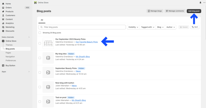
Step 1: Access store
Log in to your Shopify Store.
Step 2: Access blog post
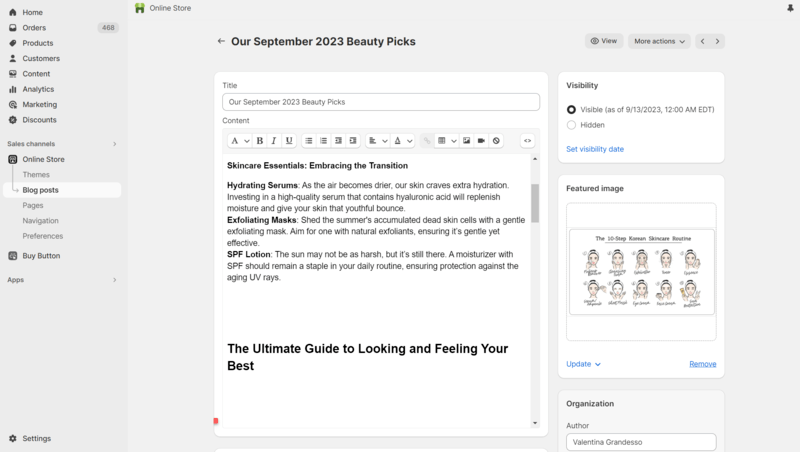
Head to ‘Online Store > Blog posts’ and click on ‘Add blog post’. Or click on one of your existing posts if you want to add a button to an existing blog.
Step 3: Copy code
Copy the HTML code of your button. You can do this by right-clicking on the button and selecting ‘Inspect’. Feel free to play around with the look and feel of your button if you have knowledge of CSS.
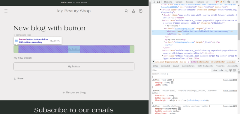
Step 4: Paste code
Paste the copied code in the HTML Editor View of your blog template. You can edit the CSS and Javascript inline.

Step 5: Preview
Preview how it looks by switching back to the Normal Editor View
Step 6: Customize the Button Design
Before saving, take a moment to customize how your button looks. Shopify allows you to adjust elements like color, size, and font using inline CSS or by editing your theme’s .liquid files. A button that contrasts with your background color (while still matching your brand palette) tends to perform best for visibility and clicks.
If you’re comfortable editing code, open your theme editor (Online Store > Themes > Edit Code) and locate the relevant file, such as blog.liquid or article-template.liquid. You can then tweak the button’s styling directly in the HTML.
Step 7: Test Before Publishing
Always preview your post before publishing. Check how the button appears on both desktop and mobile screens to ensure the text doesn’t cut off and links open correctly. Testing across devices helps avoid broken layouts and improves user experience—an important ranking factor for Google.
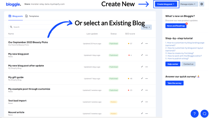
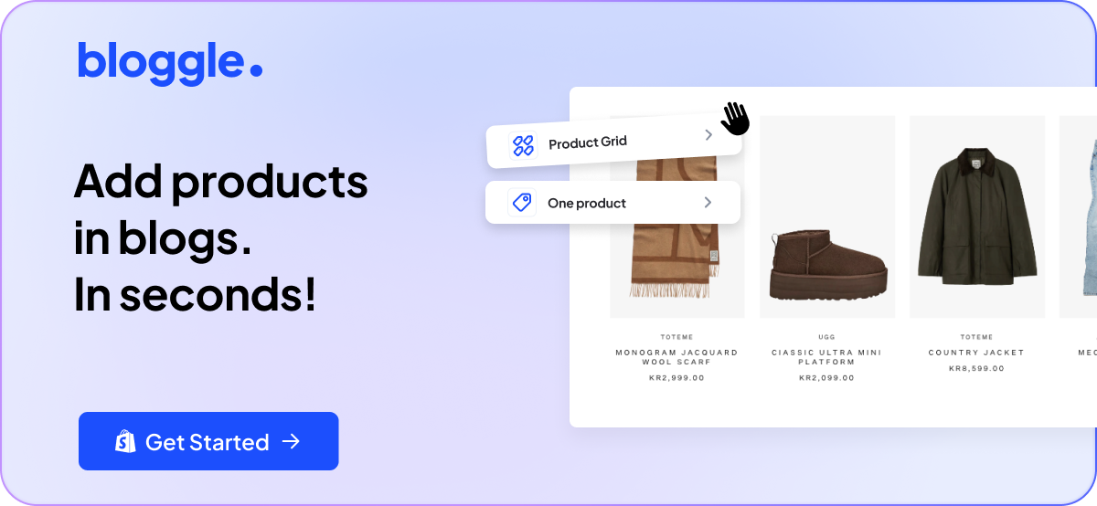
2. Via Bloggle - a Shopify App
Step 1: Access the Bloggle app
Navigate to your Bloggle Dashboard on the homepage.
Step 2: Access your blog post
Create a New blog post / Open an existing one
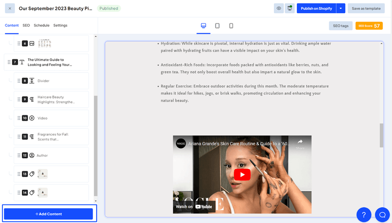
Step 3: Add element
Click on ‘Add Content’ on the bottom left
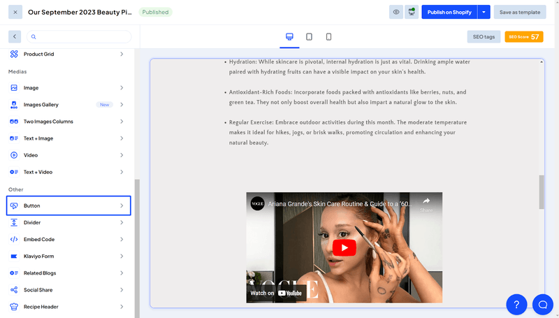
Step 4: Select "Button" option
Scroll down and click on ‘Button’
Step 5: Customize text
Enter the Button text you want. E.g. “Subscribe Now” button for your blog.
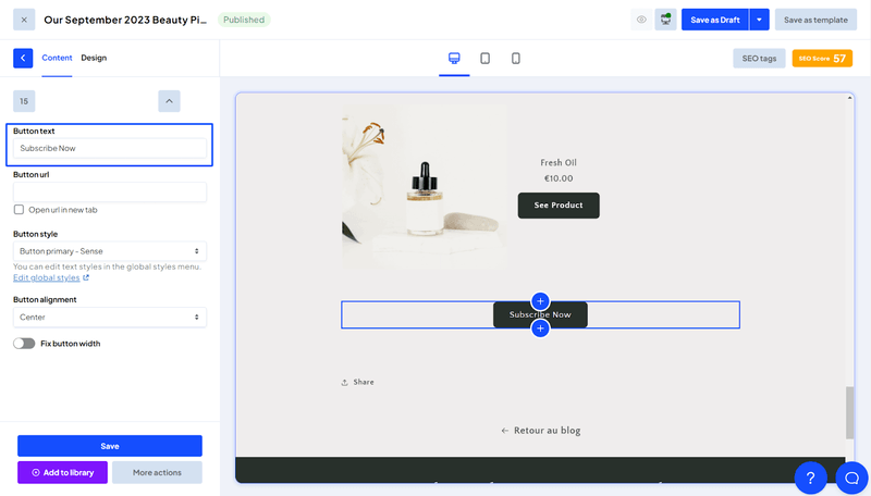
Step 6: Add link
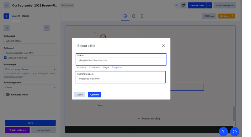
When you click on ‘Button URL’, you will see a popup. Add the URL for the button. You can add various links like products, collections or redirect to a specific page. In this case, let’s link it to the ‘Subscribe Now’ page.
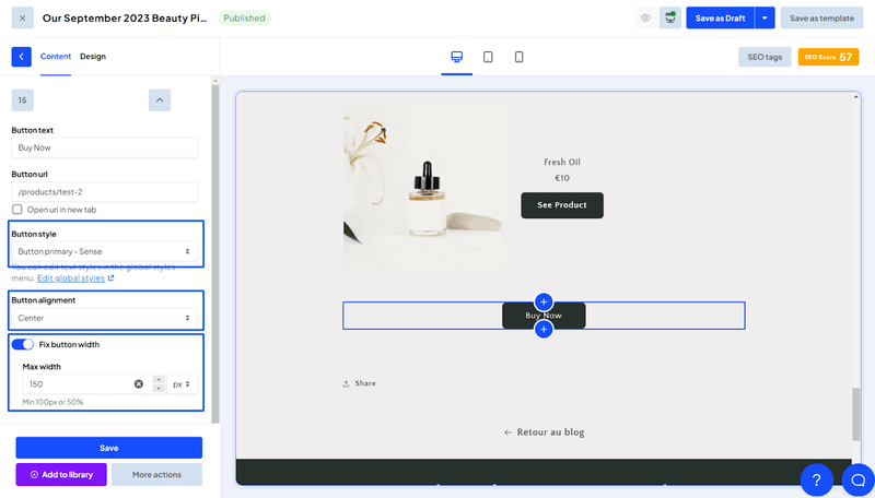
Step 7: Adjust alignmentand width
Select the Button Style and Button Alignment (Left, Right, Centre).You can choose to fix the width of the button by clicking on the toggle “Fix button width”. Enter the size of the button max width if you want to fix it.
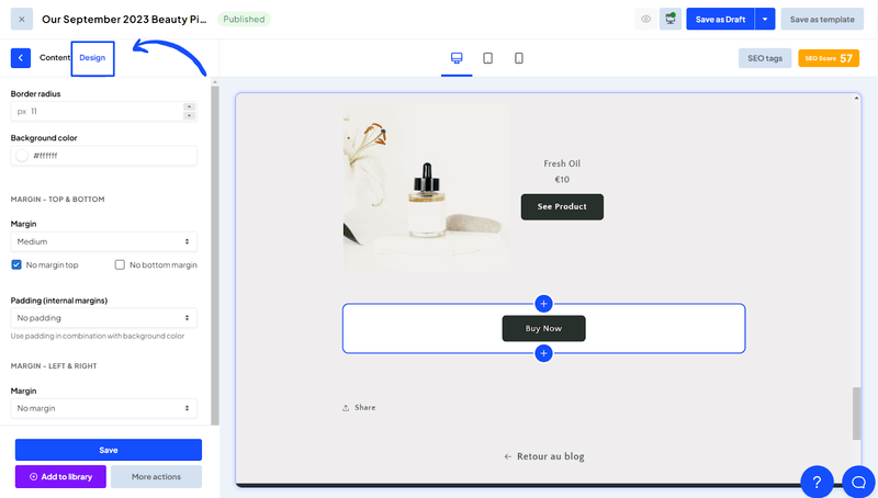
Step 8: Customize design
You can play around with the design of the button in the ‘Design’ tab. Here you can modify the Border Radius, Background color, Margins and Padding.
Step 9: Save
Click on “Save” and done.
Congratulations, you just added a buy button on your Shopify blog!
Pro Tip: Similarly, you can add other buttons to blogs. For example,
- Social Sharing Buttons for your webpage
- Compare Plans button for your Pricing page
- Subscribe buttons for your Shopify / Wordpress blog
- CTA buttons on your landing page
Best Practices for Buttons
Unlocking the full potential of buttons on your Shopify blog post goes beyond merely slapping them onto the page. It's an art and a science, a delicate balance between aesthetics and functionality. In this section, we'll delve into the nuances of button design—color, size, shape, and more—that can significantly influence your users' actions.
1. Design
Color
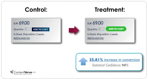
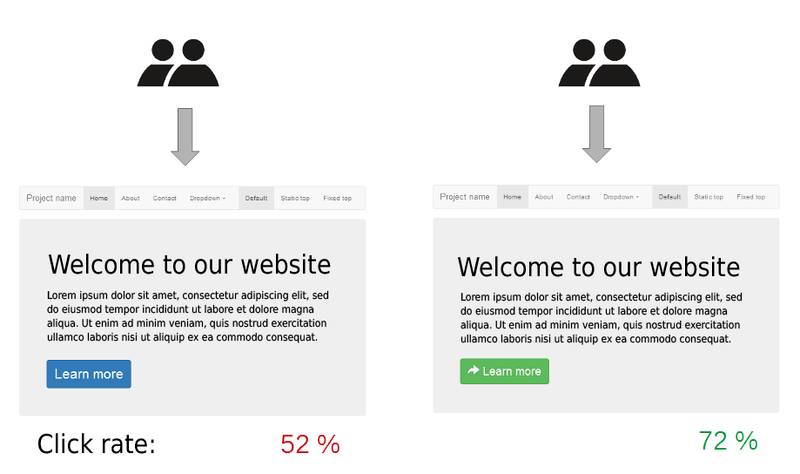
The color of your button isn't just a design choice; it's a psychological nudge. According to a study by HubSpot, a red button outperformed a green button by 21%. So choose a color that aligns not just with your brand but also with the emotions you want to evoke.
Size and Padding
Don't underestimate the impact of the button's physical dimensions. Too small, and it may go unnoticed; too large, and it may overwhelm. The Goldilocks principle applies here: aim for a size that's just right, with adequate padding to make it clickable without being cumbersome.
Shape
While a button's shape may seem like a minor detail, it subtly contributes to the user's experience. Whether you opt for rounded edges or a classic rectangle, ensure the shape complements the overall design of your blog.
Font
Typography matters. Choose a font that is legible yet engaging, one that complements the rest of your content without stealing the spotlight.
Icon Usage
Icons can serve as visual cues that support your call-to-action. A shopping cart icon next to a buy button, for example, can make the action more intuitive. This can also make the checkout process much quicker if the action is clear.
2. Content
Crafting the text for your button is akin to writing a headline for a news article; it has to capture attention and spur action within a confined space. Here's how to ensure your button text is not just filler but a catalyst:
Use Action-Oriented Verbs/Phrases
Choose words that are not just verbs, but action heroes. For instance, "Get Started" creates a sense of momentum, while "Unlock Access" implies a reward. The verb should be a launchpad for the user's next action.
Be Specific
Vagueness is your enemy. When a user reads your button, there should be no doubt about what will happen next. Instead of just saying "Download," how about "Download Your Free E-Book"? Specificity removes ambiguity and adds value.
Keep it Short and Concise
Think of your button text as a tweet: it has to convey meaning in a limited space. Aim for 2-5 words that are direct and to the point. For example, "Add to Cart" is infinitely better than "Click here to add this item to your shopping cart."
3. Placement
In real estate, they say the three most important things are location, location, location. The same holds true for your buttons. The location of your button on the blog can be the tipping point between user engagement and user exit. Here's how to strategically place your buttons:
Above the Fold (For Critical Actions)
Essential buttons, like those for making a purchase or signing up for a newsletter, should be visible without requiring the reader to scroll down. This ensures that the action you most want the reader to take is immediately accessible. Typically, these buttons should be near the product images and product details so that it becomes more intuitive to purchase products.
End of the Blog (For 'Read More…')
If your goal is to keep the reader engaged with more content, a well-placed button at the end of the article can serve as a seamless transition. This button could lead to related articles or product details that would interest your audience.
Avoid Overuse
Too many buttons can be overwhelming and counterproductive. They scatter the reader’s focus and dilute the impact of each individual button. Limit yourself to the essential actions you want the reader to take, and position those buttons strategically.
4. Testing and Analytics
The art of button optimization doesn't end once your blog post is live. In fact, that's merely the starting line. To ensure that your buttons are as effective as possible, you need data-driven insights. Here's how to gain those:
A/B Testing
Don't rely on intuition alone; let empirical evidence guide you. A/B testing allows you to experiment with different variations of buttons to find out which performs the best. Tools like Google Optimize or Optimizely can facilitate this process.
Click Rates
Understanding how often your buttons are clicked is crucial but knowing if those clicks lead to the desired action is vital. Analytics tools like Google Analytics or Clicky can help you track not just the click rates but also the conversion paths.
So, mastering the art of button implementation on your Shopify blog involves a multi-faceted approach. From design aesthetics to precise wording, from strategic location to data-driven analysis, each element plays a critical role in engaging your audience and driving conversions.

BONUS: You've stuck with us this far, and as we hinted earlier, there's a bonus for your commitment. Take your calls-to-action to the next level with this resourceful CTA generator by HubSpot.
5. Mobile Optimization
More than half of Shopify traffic comes from mobile, so your buttons need to be tap-friendly. Follow these quick rules:
- Ensure your button is at least 44px tall, the recommended minimum touch size.
- Add enough white space around buttons to prevent mis-taps.
- Center important CTAs on smaller screens for maximum visibility.
6. Consistency and Hover Effects
Keep your button styles consistent across your blog: same color palette, font, and shape. This builds trust and makes navigation predictable.
Add hover effects (like a slight color shift or shadow) to provide visual feedback when users interact with buttons. Subtle animations signal that your site is modern and responsive without being distracting.
7. Data-Backed CTA Design
Backed by data, red or high-contrast buttons often outperform neutral tones. HubSpot’s research found that red CTAs converted 21% better than green ones in tests. These small design tweaks can significantly increase click-through rates
FAQs
1. Can I sell items on my blog?
Yes, you can. Inserting a buy button into your Shopify blog post means you're not just informing, you're selling. You can directly link this button to the checkout page of your product.
2. Can you link products on a blog?
Absolutely. You can embed product links or even integrate buttons that lead directly to your product pages. It's akin to a sales rep subtly pointing towards the merchandise as they talk.
3. How do I add an "Add to Cart" button in Shopify?
You've got options. Use Shopify's built-in features or go for specialized third-party apps like Bloggle. It's like choosing between cooking at home and ordering gourmet: a matter of convenience and customization.
4. How do I track button clicks on my Shopify blog?
You can track button clicks using Google Analytics or Shopify’s native reports. Simply tag your buttons with onClick event tracking or use Google Tag Manager to create a “Button Click” event. This helps you measure which CTAs drive the most engagement and conversions.
5. How can I make buttons mobile-friendly?
Ensure your buttons are large enough for tapping (at least 44px high) and spaced away from other clickable elements. Preview your Shopify blog on mobile devices before publishing to verify placement and readability.
Conclusion
We've dissected the strategy and execution behind adding effective buttons to your Shopify blog: covering design, content, placement, and analytics. Implement these best practices to optimize user engagement and increase conversions. The right button can serve as a pivotal touchpoint in your customer's journey, transforming mere interest into decisive action.


.svg)
